
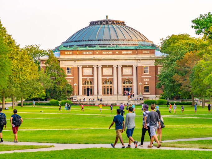
Large university campuses can be exciting, but they can also be frustrating to navigate. Students may need to cross several buildings between classes, visitors may not know which entrance to use, and accessible routes can differ from the shortest route.
How many wrong turns does it take before a campus starts to feel confusing rather than welcoming?
A July 2026 study published in Buildings tested supplementary floor signage in a complex university teaching building and found that mean wayfinding time dropped from 163.75 seconds to 133.80 seconds, an 18.29% reduction.
Here’s What’s Inside
This guide focuses on seven practical improvements:
- build one searchable campus map;
- place signs at real decision points;
- connect walking, cycling, and shuttle routes;
- make accessible navigation easy to find;
- use memorable landmarks and campus zones;
- turn orientation into navigation practice;
- test routes and keep information current.
Universities can start with the locations where people get lost most often, measure what changes, and then expand the solutions that work.
1. Build One Searchable Map for the Whole Campus
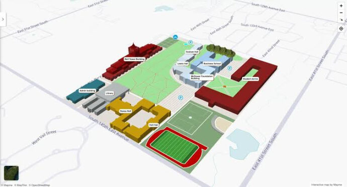
A campus map should answer a practical question: “How do I get from where I am to the exact place I need?” That means going beyond building outlines.
Students should be able to search for lecture halls, laboratories, faculty offices, libraries, parking, restrooms, and entrances, then continue navigating after they enter a building.
Useful features include:
- room-level search;
- indoor and outdoor routing;
- floor changes and elevator locations;
- accessible route choices.
Visioglobe’s current university mapping solution includes indoor navigation, routes adapted to users’ mobility needs, multilingual support, room information, and tools for displaying an entire campus through one mapping environment.
Those are useful capabilities to compare when choosing a digital university campus map. Check their website for more info: https://visioglobe.com/.
2. Put Signs Where People Actually Make Choices
More signage is not automatically better signage. The most valuable signs appear immediately before someone needs to choose a direction: at path intersections, corridor junctions, building entrances, elevator lobbies, and exits from parking areas.
A 2025 systematic review by Diego Joseph Villalon and Andrea Mangiatordi, published in Interaction Design and Architecture(s), screened 580 papers and identified 19 as especially relevant to universal-design wayfinding on university campuses. The review highlighted strategic sign placement, simple information, progressive delivery of directions, and early user involvement in the design process.
Practical rule: A sign should answer the next navigation question, not try to explain the entire campus.
Keep names consistent, too. A building should not have one name online and an unexplained abbreviation on nearby signs.
3. Connect Walking, Cycling, and Shuttle Information
Large campuses are often multimodal. A student may walk from a residence hall, take a shuttle across campus, then continue on foot to a lecture building. If maps treat those stages as unrelated journeys, users are left to work out the connection themselves.
| Travel mode | Information to show | Practical benefit |
| Walking | Paths, crossings, entrances | Helps avoid unnecessary detours |
| Cycling | Bike routes, racks, restrictions | Makes short trips easier to plan |
| Shuttle | Stops, routes, service information | Helps users plan connections |
The important part is continuity.
A shuttle stop should not be treated as the final destination when the classroom is another five-minute walk away. Show the last walking segment, the most suitable building entrance, and temporary closures that could change the route. That makes campus transportation information useful as part of the wider navigation system rather than as a separate timetable.
4. Make Accessible Routes Part of the Main Wayfinding System
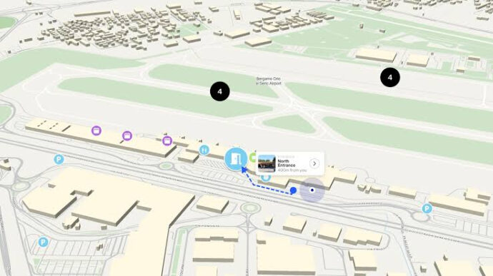
Accessible navigation should not be buried in a separate PDF or an obscure accessibility page. It should appear within the same campus mapping and signage system used by everyone else. Some users may need step-free paths, elevators, accessible entrances, gentler routes, or alternatives when construction blocks the usual path.
Universities should clearly identify:
- accessible entrances;
- elevator locations and floor access;
- step-free outdoor routes;
- temporary barriers and detours.
For U.S. campuses, the U.S. Access Board explains that ADA standards apply visual requirements to directional and informational signs, while signs identifying certain permanent rooms and spaces are subject to visual and tactile requirements.
The practical point goes beyond compliance. Accessibility information has to match real conditions. A mapped route is not useful if the entrance is locked or the elevator serving it is unavailable.
5. Use Landmarks and Zones People Can Remember
People rarely memorize a large university campus as a collection of building codes. They remember the library, the main lawn, the student center, the stadium, a clock tower, or a distinctive sculpture outside a lecture hall. Universities can deliberately use these places as navigation anchors.
Dividing the campus into recognizable zones also helps. Labels such as “North Campus,” “Health Sciences,” or “Arts Quarter” give visitors a broad sense of location before they need detailed room directions.
Landmarks work best when maps and signs use the same names.
6. Turn Orientation Into Real Navigation Practice

Traditional campus tours help students get an overview, but following a guide is not the same as finding a building alone. Orientation becomes more useful when students practice routes they will actually need during the first weeks of the semester.
Simple tasks might include:
- finding the library from a residence hall;
- locating the department office;
- traveling from a shuttle stop to a lecture room;
- identifying the closest student services location.
Differences in wayfinding behavior is associated with country of origin and native language, making clear and flexible orientation especially relevant on international campuses.
The good news? This does not require an elaborate program. Self-guided map links, QR codes, short route challenges, and small-group exercises can build familiarity before the first busy week of classes begins.
7. Test Real Routes and Keep Navigation Information Current
A wayfinding system is only as useful as its latest update. Departments relocate, buildings are renovated, entrances close, pathways change, and construction can turn yesterday’s simplest route into a dead end.
Universities should assign clear responsibility for navigation information. Facilities teams, accessibility staff, transportation departments, and academic units may all provide updates, but one process should bring those changes into maps and signs.
A practical maintenance routine can include:
- reviewing high-traffic routes before each term;
- publishing temporary closures quickly;
- testing routes with people unfamiliar with the area;
- adding an easy way to report incorrect map information.
Watch where users stop, backtrack, or ask for help. Those moments reveal where the navigation system is failing. Fix the recurring trouble spots first, test the route again, and then apply the same process elsewhere.
Make Campus Navigation Easier One Step at a Time
Universities do not need to rebuild an entire campus to make it easier to explore. Better university campus navigation can come from connecting tools that already exist: searchable maps, carefully placed signs, accessible routes, transport information, recognizable landmarks, practical orientation, and regular updates.
Start with one or two high-friction areas rather than changing everything at once. Watch how students and visitors move through those locations, identify where they hesitate, and correct those points first.
Good campus wayfinding should eventually feel almost invisible. People reach the right building, entrance, and room without having to think constantly about how to get there.